 News
News  Coin Information
  About us
  Customer Service


On September 23, TRON founder Justin Sun unveiled the blockchain’s new logo on X, announcing a comprehensive brand overhaul—the first since its inception in 2017. Coinciding with TRON’s eighth anniversary, the new design goes beyond aesthetics; it is a declaration of TRON’s strategic vision as it sets sail on its next phase of growth.
The refreshed identity emphasizes strength, credibility, and recognition, reflecting TRON’s core values of integration and symbiosis. It also signals the network’s ambition to foster global cooperation and innovation while pursuing its long-term goal of building a “metaverse free port.”
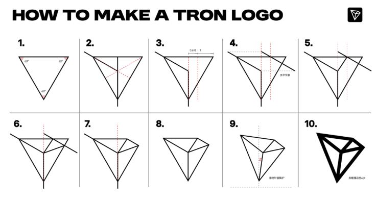
From Triangle to Polyhedron: Why an 8° Tilt?
Building on the original diamond-shaped mark and logotype, the new logo embodies a refined design philosophy:
-
The Logomark: The original polyhedron has been restructured using the golden ratio to convey greater order and stability. The design process begins with an equilateral triangle. Perpendicular lines drawn from each vertex identify the orthocenter. A golden ratio point is then marked between the orthocenter and the vertex. A parallel line through this point creates intersections with the triangle’s sides, which are joined to the orthocenter, forming the polyhedron. Finally, the shape is rotated 8 degrees clockwise—a nod to TRON’s eighth anniversary and the number’s association with prosperity in Chinese culture.
-
The Logotype: The TRON wordmark has been fine-tuned for balance and clarity. Adjustments to spacing and letterforms enhance readability and harmony. A subtle but deliberate detail is the dot inside the “O,” which acts as an anchor point that balances visual weight across the wordmark.
Both elements feature bolder lines to convey solidity and trust. In a Web3 landscape where credibility is paramount, TRON positions itself as a blockchain of strength and dependability through this carefully crafted visual language.
TRON has preserved its signature red, now standardized as Pantone 185C, while replacing the traditional black-and-red scheme with a cleaner red-and-white palette. The result is a lighter, more futuristic identity.
Learning from Global Logo Evolutions
The most successful brand refreshes strike a balance between honoring heritage and signaling future direction. Xiaomi’s softened edges reflected its vision of technology woven seamlessly into daily life. Walmart’s brighter, friendlier logo reinforced its commitment to personal connection and trust. In the same spirit, TRON’s sharper geometry and stronger contours signal its determination to lead the next era of digital finance.
Beyond Visuals: The Strategy Behind TRON’s Logo Refresh
From fine lines to bold contours, the logo encapsulates TRON’s eight-year journey from disruptive startup to industry heavyweight.
The redesign is more than cosmetic—it represents TRON’s strategic ambition made visual. As the network accelerates its global expansion, a unified and recognizable brand image becomes essential to its growth.
TRON has already secured its place among the world’s top three public blockchains. It now supports more than 330 million global accounts, over 2 million daily active users, and a TVL exceeding $28 billion. Looking ahead, TRON aims to dismantle barriers of traditional finance, empowering all 8 billion people worldwide to exchange value and create assets with freedom and equity.
The new logo embodies this ambition. It communicates power, trust, and distinction while symbolizing TRON’s leap into a future of openness and global influence.
A New Journey Toward Financial Freedom
The logo’s bold lines, parallel structure, and 8-degree rotation strike a delicate balance between heritage and innovation. More than a visual upgrade, it is a promise rendered in geometry.
Unveiled on the blockchain’s eighth anniversary, the refreshed logo pays homage to TRON’s past achievements while opening a new chapter of growth. It reflects TRON’s mission to bring financial freedom to all 8 billion people on Earth—through technology, trust, and openness.
With eight years of progress behind it, TRON now moves forward with renewed vigor, ready to chart the course for the future of global digital finance.


Comment 0